
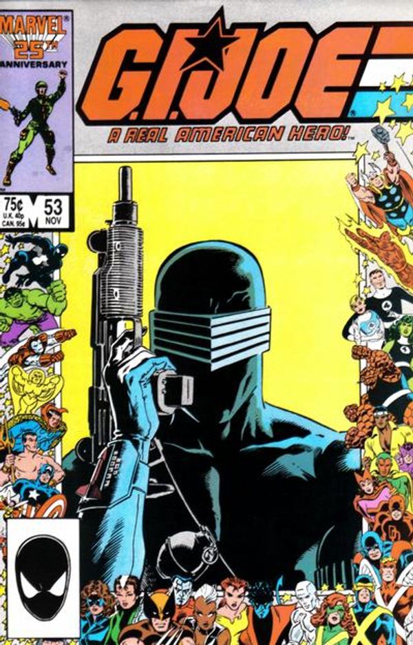
My reading of books published in August of 1986 starts with a belated comic. I got Batman #401-403 is a three pack together, and I believe that it was from a toy store this time? Maybe another deal like that Man of Steel partial set with the cardboard envelope at Circus World? Despite still considering myself a Batman fan in this period, as with Superman, I had never made much of an investment in the hero's comics adventures up to this point. Their Pre-Crisis solo outings mostly bored me, but these stripped down post-400 Batman logo treatments had that air of late '80s sophistication. Decades removed, this genre-embarrassed generic fontiness would get an immediate veto, but at this point gave the title a cool aloofness. I wasn't used to seeing John Byrne drawing DC characters, and Magpie barely qualifies, as she's a rarely seen again new villain with a rare penchant for voluntary alopecia. I'd turn to crime too if I had to maintain three separate Mohawk hairstyles simultaneously on the same head. But anyway, getting past the Byrne, you had admittedly rough and rushed Trevor Von Eeden interiors, coming off the failed Thriller series. He'd drawn what is still one of my favorite Batman things ever, the 1982 Annual with Ra's Al Ghul, and his minimalism just played into that "yes, it is a Batman comic, but we don't care if you know that" vibe. Von Eeden was the original artist chosen for Year One, before being replaced by David Mazzucchelli, and there's a continuity between their Tothian styles. I'm not sorry things worked out as they did, since Mazzucchelli was at the peak of his powers on a story that remains a high water mark for the medium nearly four decades on. But if I may be so bold, I can't say Von Eeden wouldn't have had at least a similar impact, and he manages to convey a real menace in Magpie that nothing about her name, look, or modus operandi would suggest she could pull off otherwise. It's a little insane to me that there's a Brian Bolland pin-up at the back of this thing, that may well have been intended for the cover, and it's the least visually striking element of this package. "The New Adventures" branding is many months out, but Barbara Randall's edgy story suggests the attitude well in advance. This is the last week of launch titles for the New Universe line, and it's probably not a great sign that I went to read the first issue of Displaced Paranormals, or D.P. 7, and realized that I'd already read it in recent weeks but forgotten. It had a police line-up cover that was like Love & Rockets on Lithium, and was about a more mundane but diverse team of X-Men who run away from the School for Gifted Youngsters when they found out Professor X was going to lobotomize and sell them out to the C.I.A. I was never that into the late Paul Ryan, and gave this book a pass on art alone, but my brother bought it, so I eventually read his. On the other hand, I did buy Justice #1, which was more of a New Universe breaker than Star Brand, which took all the heat. Created by Archie Goodwin and Walt Simonson, Justice borrowed heavily from the Terminator, featuring a tall, well-built New Wave Punk in a trench coat with glowing red eyes who wanders around Alphabet City killing other punks, seemingly indiscriminately. Simonson bailed as soon as the development money ran out, but Goodwin had a staff editorial position, so he was stuck teaming with young artist Geoff Isherwood to get the book out. Isherwood was more in the Neal Adams vein, and therefore my own, plus I wasn't hip enough to know Justice's whole scene was derivative and years out of date. It helped to cover that this was actually a stealth high fantasy series, with the silver-mulletted quasi-knight Tensen having been exiled to Earth from another dimension by magical ninjas after his affair with the queen was discovered. With patchy memories and no clear way home, Tensen uses his ability to see the auras of others to judge good versus evil. His right hand is a "sword" that fires destructive energy to reduce to ash any wicked that Tensen finds, while his left hand is a shield that erects force field squares to protect those deemed innocent. And again, since Star Brand was comparatively morally and structurally complex, the Justice vigilante just goes from drug dealer to pimp and so on, killing all the bad ones, and learning of the joys of hot dogs paid for in blood. All inked by Vinnie Colletta, looking like Jim Mooney doing a Death Wish comic. So it was dumb and violent when that was the style of the time, and I'd be back for seconds. The cover to G.I. Joe a Real American Hero #53 is a Mike Zeck Snake-Eyes head shot, and I bought it on a t-shirt just this year. Hey, it's a chest-up, and he also draws a forearm holding up an Uzi. Within the parameters of the assignment, Zeck went above and beyond. But also, Snake-Eyes isn't even in this issue. "Pit-Fall" is about Cobra forces assailing the headquarters of G.I. Joe while the team is on suspension and the actual members are off-site. It's mostly about older brass who were deliberating on the Joes' fate being put in the position of having to replace them. But more importantly, it was a Flint spotlight issue, as he and Lady Jaye are two of the few members in the area, and Flint sacrifices himeslf to make sure his best gal could serve the greater good. Uncanny X-Men #211 was the proper launch of the Mutant Massacre crossover, with another iconic JRJR Wolverine cover, this one a close-up of popped claws and frayed mask with a Marvel 25th anniversary border. Not being well versed in detecting art styles, I just assumed Romita had done his usual work on the interiors, though it's now obvious Bret Blevins provided a fair share of the pencils on this issue. Credit to Al Williamson for keeping the overall look consistent, though I was easily distracted by all the murder the Marauders were up to, followed by the X-Men getting ripped to bits trying to stop all that murder. We lapped this up in the '80s, but I admit that it's harder on the system at middle age to watch all this wholesale slaughter as entertainment. Honestly, it was much more abstract and fanciful back then, before you could watch videos of actual atrocities online. Given how much I and much of my generation hated Blevins' New Mutants run, looking at these pages, it's kind of a shame that he didn't get the Uncanny assignment instead. Objectively, Blevins was great at drawing awkward teenagers, where Marc Silvestri would have sexed them up like he did the kids in X-Factor. However, I don't care about New Mutants, and Blevins would have been a smoother transition from Romita. I'll also point out that this issue offered The Marvel Mutant Massacre Map, with Walt Simonson doodling in Beast, Nightcrawler, Angel, and one of the Power Pack kids while detailing the reading order of the sprawling 11-part, five title crossover. This was an extremely successful and well regarded event story that led to Marvel having their entire line of $4 books loosely connect for months on end today. This entire event cost barely more than two of those modern books, and involved three closely associated writers. We've lost so much common and story sense in the intervening decades. I don't have the time or interest to go back and read all of these comics, but for various reasons there are a number of 1986 titles where I'm reading along with or ahead of this coverage. In the case of Classic X-Men #3, I bought an omnibus collection a while back, but I'm not sure when I'd ever read the thing without being prompted. I haven't had the slightest interest in the X-Men's modern adventures in decades, but I was deeply invested in the mutants of this time period. Since the collection only reprints the newly created material, as it progresses, we're talking about an investment of 6-8 pages a month, though they're written by Chris Claremont, so that's only about 48 pages worth of contemporary comics reading. Unfortunately, I waited three issues in to start. To make the original Len Wein issues more his own, plus to summarize a giant sized comic into a standard one, dozens of new pages were commissioned to, ironically, shrink the overall narrative. In other words, I went through pages 6-73 of the omnibus in service to following these "short" stories going forward. As it turns out, Dave Cockrum did come back for a lot of those interstitials, but he was so heavily embellished by Bob McLeod that I thought the inker did the whole page himself. Cockrum's work was already in decline by his second stint on X-Men, and we'd had the Paul Smith and John Romita Jr. runs since, so maybe that was for the best. I also didn't recall John Bolton's work being so impressionistic as I find it here, and in fact I now think I see a strong influence of this period's work on the artists Brian Stelfreeze and Jason Pearson, who are a few years out from getting published. Another head shot cover, this time of Storm. This issue involves the death and funeral of Thunderbird, but he was little remembered in this period, so commercial considerations exiled him posthumously to the inside frontpiece by Art Adams and Bolton's back cover. G.I. Joe Order of Battle #1 started a four issue mini-series cover-billed as "The Official G.I. Joe Handbook," but drawing direct comparison with OHOTMU does it no favors. And it's in the drawings where it most comes up short, because instead of enlisting talented artists associated with both, like Mike Zeck, everything here is drawn by Herb Trimpe and Joe Delbeato. Simply drawing 32 Joes in full body static poses could be numbing for a set of artists, much less the same two guys, and they're rendered in an oddly passive manner for a bunch of rugged soldiers. Besides the lack of visual variety, there's no sourced reprint images to break things up, just one figure per page insides a file folder shaped box. The order is also rigid, listing only heroic Joes in alphabetical order for two issues, a third just for Cobra, and the fourth all vehicles. They don't even maintain the single creative team policy, because Eliot R. Brown does the vehicle issue by himself. Greater stylistic liberties are taken with Cobra, and they're just visually more dynamic in general, so it really would have broken things up to mix them and the vehicles in with the Joes. In my case, it was a fatal error, because I was so bored by the first issue that I didn't go back for more. Larry Hama was in file card mode, maybe offering an extra paragraph on top of what could be found on the action figure packaging, and far too fixated on dry data like what weapons they'd trained with, vehicles they were cleared to operate, and so on. The one almost backhanded compliment I can give is that I think Trimpe was enamored with Paul Smith at this time, because most of these entries have a PMS vibe. I was also a big Smith fan in this period, but I'm not sure he's the artist to ape for this subject matter or the target demographic.


No comments:
Post a Comment