
20) Green Lantern #190 (July, 1985)

I had a much tougher time with the twenty slot than the #1. It was the gatekeeper prohibiting entry to a couple dozen more entirely worthy covers. In the end, those eyes and the violating intimacy of the Predator secured this book the endcap.
19) JLA #103 (October, 2004)

I really wanted at least one JLA cover on this list, but his role there often fell into tokenism. Racial themes play out in this solo spotlight that speak to his treatment, and also to Stewart's occasional authoritarian leanings.
18) Green Lantern #188 (May, 1985)

I've never been a big Joe Staton fan, and that afro needs a pic. Still, it's a triumphant image, and a landmark, as Stewart publicly unmasks.
17) Green Lantern #156 (January, 2003)

John Stewart is finally the sole Green Lantern of Earth! For an issue here and there, and for the purposes of bringing JLA temporarily in line with the cartoon! Let's celebrate with an awkward Ariel Olivetti cover involving a caricatured Asian child!
16) Green Lantern: Mosaic #17 (October, 1993)

Luke McDonnell was nearing his nadir on interior art (see: Armageddon: Inferno,) but this is a masterpiece compared to most of the terrible covers Mosaic suffered through. Plus, Katma Tui, and John's abstract (some would say unstable) mind of the time on display. Geoff Johns' take on the character is so damned simplistic, especially compared to Gerard Jones' dense layering.
15) Justice League Unlimited #46 (August, 2008)

The final issue, with John leading a GL charge. You'll note this is the only bald/goatee'd image on this list, because I am sick to death of every black male super-hero shaving their head.It stops being cool when everybody's doing it, and Luke Cage without sideburns is a mother-truckin' travesty!
14) Green Lantern #197 (February, 1986)

I just like seeing John up in Guy Gardner's face, plus the facial structure on both GLs is outstanding.
13) Green Lantern #183 (December, 1984)

I'd like to like this cover more, but the premise has played out on so many covers, I can't get excited. It was already tired by 1984, it makes John look like a jerk, and what is with his skin tone?
12) Green Lantern #49 Variant Cover (February, 2010)

Benes almost made the list, but it just couldn't get there. Painted covers are often top static/subdued for my taste, but the specter of Xanshi had to be represented on this list.
11) Justice League Adventures #11 (November, 2002)

A lot of Super Friends covers with a prominent John Stewart fell just short of the mark, and the same was true of this series. Green Lantern is proud and up front here in a really appealing way, so it broke the blockade.
10) Green Lantern #193 (October, 1985)

Staton really sells the desolation and the threat to John here, in the best cover yet in portraying a deeper seated and more potentially devastating rivalry with Hal than Jordan ever had to face with Guy. John Stewart is a good man, but he is not Hal Jordan's friend, and is most especially not his sidekick.
9) Green Lantern #17 (October, 1991)

Hal Jordan quitting the Corps covers are a dime a dozen, but when John does it (this one time) it resonates.
8) Justice League Adventures #19 (July, 2003)

Name a more widely recognized black super-hero than John Stewart. Okay, Storm. And Blade. And maybe War Machine, nowadays. Look, for DC it's John Stewart, so this cover has greater meaning than might first be apparent. It's a "Yes We Can" kind of thing.
7) Green Lantern #74 (June, 1996)

Answer: None of the above, but it sure sells the danger, doesn't it? Also, I think this is one of three covers featuring John in his Darkstars uniform, and nobody else ever wore it as well.
6) Green Lantern #165 (June, 1983)

It makes me sad that there isn't more Gil Kane on this list, but he was always Hal's artist, and shared covers saw John trailing behind. There was one that got cut with the pair joined by Guy, all in the standard GL uniform, powering up. However, a stupid Guardian's head and ugly coloring ruined the piece. John + red= intensity. Anyone who followed Mosaic knows what I mean.
5) Green Lantern #16 (September, 1991)

A quiet cover, but the weight John is carrying on his mind is palpable.
4) Green Lantern #147 (April, 2002)

Had to bring in the chair at some point. This is the one where we learn Stewart was never actually crippled, only doing a pathologically method Hawkeye Pierce impersonation.
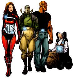
3) Green Lantern: Mosaic #1 (June, 1992)

A beautiful Brian Stelfreeze painted cover to launch one of the most challenging and under-appreciated series of the 1990s. Fans of Jones' Martian Manhunter: American Secrets owe it to themselves to give this a try, despite the erratic art and forced conclusion.
2) Green Lantern #185 (February, 1985)

See what I mean about the red? This is how you make an entrance! Folks forget John Stewart starred in this book for over a year with Hal just a subplot, and it was probably the best longterm story arc of the entire series.
1) Green Lantern/Green Arrow #87 (January, 1972)

Editor Julie Schwartz actually forced Neal Adams to redraw this cover because Hal looked to weak and effeminate in the unpublished version. It's kind of a shame, because John was more handsome there, but this one portrays a more dynamic character. Either way, it's an American classic!


2 comments:
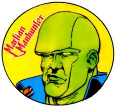
I like how #16 is an American Gothic riff, which is made even better by an appearance of the Martian Manhunter in the background.
Mosaic is something I always wanted to get around to reading, and direct comparison to American Secrets has motivated me a little bit more.
American Secrets and Mosaic are vastly different, extremely similar books. Mosaic is more personal and demanding, but it's also meandering, atonal, and willfully obtuse. If American Secrets is Blue Velvet, Mosaic is the second season of Twin Peaks.
Post a Comment