
Blackhawk was Quality Comics' flagship title, and the only one to not only continue publication after the company's demise, but to do so without missing an issue. While Chop-Chop immediately looked more like an actual human being with the shift to DC, there was little else different from a scan of the covers. I suspect that's the problem, because Blackhawk has fought a losing battle with relevancy since the 1950s. When the changes did come, they were breakneck in just about every sense of the word.
I've looked over nearly 500 covers for this countdown, and where it might normally be an intimidating proposition to boil that down to a top twenty, not so much here. There's a lot of samey-samey, to the point where I suspect Blackhawk was an unsung pioneer of swiping. I'll elaborate as we progress, but first...
Top 5 Dishonorable Discharges
Military Comics #4 (November, 1941)

Many of the early Blackhawk covers were poorly designed, whether it be static boxes for multiple features, cheesy side advertisements, overcrowding, excess negative space, or just plain bad work. The above image would emphasize the latter, as men buried to their necks in ant mounds or otherwise heinously tortured should not come across as comical. This looks more like a leatherboy fetish magazine involving radio controlled toy planes on kamikaze runs into caves.
Military Comics #15 (January, 1943)

It might have gotten confusing if a group with the Blackhawk Squadron's fashion sense had regularly fought the gestapo, but that never proved to be an issue. You see, all throughout World War II, they specialized in combat with yellow-skinned nips, so it was easy to tell them buck-toothed, swell-headed Japs were the enemy. Revisionist history usually pits heroes like Captain America and Wonder Woman exclusively against ze Germans, but it's hard to get away from Blackhawk as being one of the finest propagators of grotesquely racist Asian caricatures in mainstream comics.
Military Comics #30 (July, 1944)

Don't go thinking the Blackhawks were all about blasting slant-eyes! Why, they had one of the finest chinks alive acting as their cook/mascot throughout the war! Sure he only stood about three feet tall, had a grin bigger than his legs, had hair like a pinhead, ears that had to be factored into wind drag during flights, and perpetually carried a meat cleaver around, but he was so colorful! Sad to say, but the 'hawks' Chinese ally was probably the most prominent and positive Asian hero on period comic covers. He sure stood out in that sea of dark leather, and even if he didn't, he was often isolated/spotlighted amongst the group. Chop-Chop was certainly more memorable than most of the Squadron.
Blackhawk #230 (March, 1967)

In 1964, the Blackhawk Squadron traded their matching leather outfits for matching green tights and red pirate shirts. Three years later, they sunk even lower. After three issues of build-up, the Blackhawks became the single worst super-hero team in history, "The Junk Heap Heroes." "M'sieu Machine" runs around in a beret with a toolbelt slung like a bandoleer. Olaf Friedriksen, the team strongman, dresses up like a dildo as "The Leaper." Chop-Chop's chop-sokey affords him metal kung-fu grip hands. Chuck wears a costume covered in earlobes without it in any way meaning to relate to Vietnam atrocities. Blackhawk uses "dig" in its informal sense. The horror! The horror!
The New Blackhawk #244 (February, 1976)

No lesser a light than Joe Kubert referenced the much imitated cover to Military Comics #13 while reintroducing the Blackhawk Squadron to a new generation. Like many of the "DC Explosion" era books, it was of its time in the worst way possible. I'm not sure if flared collars and necklines plunging to the navel in an all-male, all-leather, largely mustachioed fighting squadron makes them seem more gay, or less. Given their exuberant cluelessness and the aesthetic battery these threads inflicted even in the 1970s, they have perhaps never been more plainly straight. Then again, if Joe Kubert can't make you look hard as a coffin nail, it's raining men, hallelujah.
Honorable Mention
Military Comics #1 (August, 1941)

Like many debut cover appearances, they didn't yet know what they had, so it's just kind of there to be reprinted excessively.
20) Military Comics #27 (March, 1944)

Nazis will never go out of style, because regardless of all that genocide and general jackassery, no military has ever dressed sharper. The Blackhawk Squadron saw kids preferring Cobra action figures to G.I. Joes decades ahead of schedule, and sidestepped that pitfall by dressing like quasi-Nazis themselves. They also popularized the "running at the readers" group shot, of which this is one of many, with the added twist of it being seen through a sniper's scope.
19) Blackhawk #16 (Autumn, 1947)

There are only so many group shots a bunch of tough guys can strike, and the huddle is one I don't see much in comics. It's cute, like maybe something the Beatles would have done. I don't think they could have pulled off the jodhpurs, though, and I suspect they would have made Chop-Chop East Indian.
18) Blackhawk (Blood & Iron) Book Three (May, 1988)

If you're going to "homage," Leyendecker is a good way to go.
17) Blackhawk #251 (October, 1982)

After decades of painfully stupid new directions, the Blackhawks were back in WWII where they belonged, drawn on a powerful (if familiar) cover by the popular Dave Cockrum. Unfortunately, that also meant Chop-Chop was back to being the chubby short guy in coolie wear.
16) Blackhawk #13 (April, 1990)

I rather like the ornate design, but it feels a bit empty in the background. Also, I'm all for inclusion, but who the hell are all these new guys of color?
15) Modern Comics #92 (December, 1949)

So cool, so cold, in a cockpit where he belongs.
14) Blackhawk #1 (March, 1989)

A romantically optimistic image of the type we could all use more of these days.
13) Blackhawk #206 (May, 1964)

One look at those pants should tell you this was a very bad decade to be a Blackhawk. Forcing one of your men at gunpoint to dig his own grave after over twenty years of valiant service is a special kind of messed-up worthy of note. Perhaps most importantly, there's a chance Chuck will bury that god-forsaken shirt before he's done. Amen to that!
12) Blackhawk #69 (October, 1953)

Without the Axis, the Blackhawks tried to make do with some godless commies, but they mostly subsisted on vaguely foreign threats and mildly supernatural menaces. Also, there were a lot of giant machines destroying cities. The War Wheel was the favorite that appeared again and again, but this bad boy did a nice job of evoking Mars Attacks levels of mayhem a decade early. The book desperately needed more nihilistic horror, and less Human Starfish.
11) Modern Comics #68 (December, 1947)

You'll find the '50s and '60s very poorly represented on this list. I'm afraid I found those covers very busy, but also very boring, and not a little foolish. Too many giants and tentacle creatures and other assorted BEMs. Meanwhile, this cover makes it clear how much better the basics work. A handsome if intimidating/slightly creepy aviator holding the kind of weapon that could blow his own plane out of the sky.
10) Blackhawk #260 (July, 1983)

One of a number of mighty fine Chaykin covers-- just Blackhawk flying his plane. I find that Kraut to Jap kill ratio suspect, though.
9) Blackhawk #19 (June, 1948)

The war may be over, but Blackhawk is still locked and loaded, with that monochromatic background alluding to violence to come.
8) Blackhawk #263 [Uncolored Original Art Shown] (October, 1983)

The Blackhawks fought a whole lot of cheesy monsters-of-the-month from the 1950s-1970s, very much recalling the bad old Schiff years on Batman. Count your lucky stars none of those Killer Shark covers made this list, but it wouldn't feel right if the War Wheel didn't turn up at least once. This instance involved the art of Gil Kane and a rather provocative femme fatale. A shame I don't have a colored version available, but the sky's yellow, the wheel's red, and the figures in blue.
7) Blackhawk #8 (November, 1989)

I like that there's a sunny, old school background for an image that vaguely recalls lynching, as the Blackhawks drift lifelessly in their parachutes.
6) Blackhawk #262 (September, 1983)

Chaykin clearly worked on Blackhawk a few years too late. I think he grew out of this level of enthusiasm for drawing escapist fare.
5) Military Comics #28 (April, 1944)

Any one of these guys would have proudly piloted the Enola Gay. They're just so pleased to have this opportunity to kill Japanese people.
4) Military Comics #18 (April, 1943)

The entire squadron looks great, but the vibe is a bit morose for no apparent reason, and then there's the random mongol.
3) Military Comics #21 (August, 1943)

Most of the premise is right here. Scary fascist-looking dude and airplanes. Sometimes simple is best.
2) Blackhawk #257 (April, 1983)

Chaykin sure sells the sex here. A towering stone swastika aflame with a smirking Blackhawk on top, a gun in each hand. Grumman XF5F Skyrockets in flight against a background of stars and bars. F-yeah!
1) Military Comics #13 (November, 1942)

You know all those comic covers where a hero takes point as his team charges behind him? Like Giant-Size X-Men #1? They all came from this.
Top Character Covers Countdown
- The Top 10 Aquaman Covers of the 1960s @ Justice League Detroit
- The Top 20 Atom Covers of the 1960s @ Power of the Atom
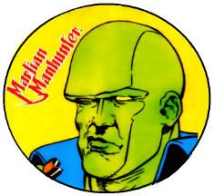
- The Top 20 Martian Manhunter Covers of the 1960s @ The Idol-Head of Diabolu
- The Top 20 Wonder Woman Covers of the 1960s @ Diana Prince
- DC75: Top Character Covers of the Dodranscentennial


No comments:
Post a Comment